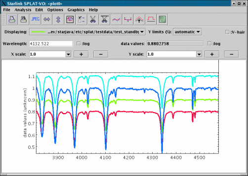
3.2 A plot window
The anatomy of a plot window is shown below:
It has three main regions, the menubar & toolbar, the control panel and the display area.
The display area
The display area shows a view of all the spectra that are currently associated with
this plot. The colours, plotting style etc. of these spectra are determined by their
global properties as set in the main browser window.
The plot title and axis labels are determined using the properties of the current
spectrum, if possible. For instance if the current spectrum is an NDF then these
values are determined from the NDF’s title, units and axis components, or for more
recent NDFs from the properties of its WCS component. Similarly for FITS files
these values are determined using the world coordinates FITS keywords. To change
these look in the Configure Plot Options window, which is activated by pressing
the  button.
The size of the area used to display a spectrum is initially determined from an
automatic match of its data and coordinate extents to the visible surface of the
display area, you can change the size of the display surface using the zoom controls
described below and/or you can change the actual data limits using the Configure
Plot Options window. When you add or remove a spectrum the apparent size of
the display region stays the same and all the spectra now displayed are scaled to fit
within it. To return to a state where the visible surface matches the display area you
need to press the  and
and  buttons.
The Configure Plot Options window also offers the ability change the colour of the
display area background, to draw the lines using anti-aliasing (which reduces the
jagged effects, but at the cost of drawing speed), to modify the reserved area around
the plot and do things like position the numeric labels, set the axis gaps etc.
The following interactions are provided in the display area.
The control panel
The control panel area provides controls for interacting with the plot. It also shows
details of what spectra are displayed in the plot and a continuous readout of the X
coordinate and corresponding data value.
The Displaying: drop down list shows the names and current rendering properties
of any spectra that are displayed. If you choose a spectrum from this list it becomes
the current spectrum and is used as the basis for the plot’s coordinates (so the
readouts now show the values of this spectrum, also the plot will be re-drawn if
the coordinate system of the newly selected spectrum is different). The selected
spectrum also becomes selected in the browser window (so you see its details more
clearly and apply modifications). This spectrum is also the one used by any tools
(such as background and line fitting) that work with only one spectrum. If you
remove this spectrum using the Edit->Remove current spectrum option then the
next spectrum in the list becomes the current one.
The Y limits (%): drop down list provides a series of quick cuts for setting the
limits of the Y axis. Normally this is the full range, but using a percentage cut can
usefully clip the range to reject extreme outlier data values. The data values used
are restricted to the limits of then X coordinates (all when automatic ranging is used,
the default ).
The Wavelength: entry control has two functions. The first is to show the current
wavelength. The second is to allow you to centre the display area on a specific
coordinate. Just type in the value you want to see here and press <Return>. Note
that the label of this area modifies to match the label of the X axis, so could say
something different to Wavelength:.
The :V-hair checkbox controls whether the ‘vertical hair’ is shown. The vertical hair
is just a vertical line that follows the mouse pointer around the display area. It can
be quite slow, so isn’t shown by default.
The X scale: and Y scale: controls change the zoom of the display area. The plus
and minus controls increase and decrease the zoom by one, or you can choose a
zoom from the drop-down lists, or you can type in a decimal value (which should
be greater than equal to one) and press <Return>.
The :log controls determine if either of the axes are drawing using log spacing (this
is not possible if either axis spans the value zero). Finer control of the log spacing
and labelling can obtained using the plot configuration window.
The Track free checkbox determines what values are shown in the continuous
coordinate readouts. When unchecked (the default) the values shown are the
nearest ones of the current spectrum to the pointer position. When checked the
readouts show the coordinates under the pointer.
Toolbar and menus
The toolbar region has a series of buttons that act as short-cuts to most of the
functions found in the main menus. Some of these create new windows with
complex actions that should be consulted for further help.
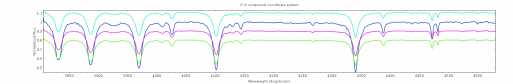
- Print a copy of the display area to an installed printer or to a file. The output
produced fits the output page format using the current aspect ratio of the
display area, so if you’re zoomed by a large factor then you’ll get an output
page that has a very small height. If you want a printout of just the visible part
then cut it out and display it in a new plot first. Postscript output from this
dialogue isn’t encapsulated. The next figure is an example of this output. Note
that if you’re looking at a paper copy of this document you’re looking at the
postscript output and if you’re looking at the on-line help it shows a scaled
JPEG for on-line copies (see item after next).
- Same as the print option, except, this only offers to write a postscript file and doesn’t
rely on having any printers installed on the local machine. The output can be in
encapsulated form for inclusion in other documents.
- Make a JPEG or PNG image version of the display area. Again the file produced fits
the output graphic using the current aspect ratio of the display area. The default is to
produce an image with a pixel-to-pixel correspondence to what you see on the screen
(if it were possible to view the whole of the area). Alternatively you can
scale the graphic to fit some dimensions that you enter, or just clip the
graphic to these dimensions. (Hint: if you want anti-aliased lines drawn
in the image select this plotting option first using the plot configuration
window).
- Make spectra fit the display area width. Use this to quickly return to an unzoomed
coordinate state and to match the X axis width when you resize the plot
window.
- Make spectra fit the display area height. Use this to quickly return to an unzoomed
data value state and to match the Y axis height when you resize the plot
window.
- Show the ‘panner’ window. You can use this to see a view of the whole extent of the
currently displayed spectra (shown at the same aspect ratio as the display area). This
also features a red rectangle that shows the extent of the display area, this can be
moved to change the display area view.
- Show the plot configuration window. This contains many controls for setting the
display area data limits, changing the plot title and axis labels, drawing grid lines,
defining how many ticks to display, changing the amount of space around the plot
edges, setting the background colour and whether to draw text or text and lines
using anti-aliasing. It also offers facilities to save these settings for future
restoration.
- Create a new spectrum (on the global list) that contains only the visible parts of the
current spectrum. You can then display this new spectrum in this or a new plot. The
new spectrum is given the name
Cut <n> of <current_shortname>. This facility is
useful to create printouts of just parts of a spectrum and to speed up processing of
very large spectra.
- Show the region cutter window. This window allows you to graphically define which
regions you’d like to cut, delete or replace by linear interpolation in the current
spectrum.
- Show the toolbox for fitting a polynomial to defined regions of the current spectrum.
This is used to define backgrounds prior to line fitting, or for subtracting and dividing
backgrounds from spectra.
- Show the toolbox for taking an interpolated curve (i.e. a spline drawn on the plot
using the features of the Graphics menu) and creating a spectrum from
it.
- Show the toolbox for fitting emission and absorption lines. This measures the line
position and equivalent width as well as fitting Gaussian, Lorentzian and Voigt
profiles to selected wavelength ranges of the current spectrum. Remember to define a
polynomial background before using this tool or have your data processed for
fitting.
- Show the toolbox for filtering the current spectrum. The filters offered are simple ones
like the average and median over a windowed area, plus more complex ones like
smoothing using any of the known line shapes and denoising using wavelet
transformations.
- Show the toolbox for selecting new coordinates or data units for the current spectrum
(and therefore plot).
- Show the toolbox for flipping, shifting or redshifting editable spectra shown in the
plot. Also allows you create an editable copy of the current spectrum.
- Show the toolbox for determining statistics (mean, standard deviation, etc.) of the
whole or parts of the current spectrum.
- Show the toolbox for apply an offsets to the displayed spectra so they
can be viewed more easily or shown in some order, for instance time of
observation.
The Options menu contains several control items whose values are preserved between
invocations of SPLAT-VO.
- Options->Match coordinates and/or fluxes. When this is selected the plot will
attempt to convert the spectral coordinates and fluxes of all displayed spectra
into the systems of the current spectrum, so that they will be aligned when
displayed.
Whether this works or not depends on whether the spectra that you have read
in contain correct descriptions (or descriptions that SPLAT-VO can make good
guesses about) of the spectral coordinates and data fluxes and whether the
flux system is supported. If this doesn’t work then check that your spectra
have valid descriptions using the toolboxes in the main browser window for
inspecting and setting spectral coordinates and data units ( and
and  ).
).
In the case of line identifier catalogues, these will also be transformed to the
rest frame of the observed source (i.e. they will be red or blue shifted if you
have defined the source velocity as part of its coordinate system definition).
This option is switched on by default. If your spectra do not need aligning
switch if off for extra performance.
- Options->Match non-flux data units. If your data units are not understood
as fluxes it may still be possible to align them (dimensionally obvious unit
conversions are possible for instance mK and K will be aligned correctly, as
will eV and keV).
- Options->Match sidebands If your spectra are dual sideband then they can be
aligned taking this into account, or they can be aligned just using the currently
selected sidebands. By default they are not aligned by taking the sideband into
account. If you want to do otherwise select this item.
- Options->Match origins If you have defined origins for your spectra to
display offset coordinate systems then selecting this will align the spectra in
those coordinates not the absolute ones.
- Options->Match using base system When matching spectra it is usual to
achieve this by transforming all coordinate systems into a common system,
this system is wavelength by default. For some systems it may be better to use
another common system so by selecting this option you can set the common
system used to be that of the current spectrum. This option is most useful
when working with velocities, when you want the alignment to happen in that
system (because the spectra have different rest frequencies).
- Options->Only display grid axes in visible area Normally the labelled axes
displaying the spectral and data coordinates are drawn to the full size of the
display surface of the plot. This is the quickest mode as it reduces the need for
re-drawing. If you select this option the axes will be only drawn within the the
visible part of the plot, which makes it easier to see the coordinate labels, but
means that the axes need to be re-drawn continually when scrolling.
- Options->Only display spectra within axes Select this option if you only want
spectra (including line identifiers) to be drawn within the bounds of the axes.
When combined with the previous option to only display axes in the visible
area this will potentially slow down scroll operations a lot, so the default is off.
- Options->Line identifiers->Load all matching line identifiers If you select
this option then all line identifiers known to SPLAT-VO (including any that
you have opened yourself), and whose coordinate ranges fall within that of the
plot, will be loaded into the global list and displayed in the plot. Note that this
will not work if the spectra displayed in the plot do not have defined spectral
coordinates.
- Options->Line identifiers->Load all matching pre-loaded line identifiers If
you select this option then all line identifiers already loaded into the global list,
and whose coordinate ranges fall within that of the plot, will be displayed in
the plot. Note that this will not work if the spectra displayed in the plot do not
have defined spectral coordinates.
- Options->Line identifiers->Positions track current spectrum If you select this
option then line identifiers that do not have data positions (this is typically
true) will be positioned above the current spectrum, rather than displayed in a
line along the bottom of the plot.
- Options->Line identifiers->Prefix name to labels If you select this item then
the short name of each line identifier spectrum displayed in the plot will be
prefixed to the label. This allows you to discriminate between crowded labels.
Note that the short name of a line identifier can be modified in the main
window, once it is loaded into the global list. For legibility any names that are
appended by _lines, will have that string removed and any underscores will
be replaced by spaces.
- Options->Line identifiers->Draw horizontal labels Select this option if you
want line identifier labels drawn horizontally rather than vertically.
- Options->Line identifiers->Show dual sideband labels Select this option if
you want line identifier labels drawn for both sidebands of a dual sideband
spectrum. The non-default sideband coordinates are displayed along the top
edge of the plot and the matching labels will be displayed in red, with either
(USB) or (LSB) postfixed to the label to avoid confusion.
- Options->Error bar auto-ranging. When auto-ranging a spectrum that has
associated errors the limits do not include the extent of any error bars that will
be drawn, if you want this to be otherwise select this option.
- Options->Draw errors as spectrum. If this option is selected and any of the
displayed spectra have errors, then those spectra with errors will be drawn
using the error value as each point on the line rather than the data values (and
conversely the data values will be used to draw error bars, if that is enabled
for any of the spectra). When displaying spectra without any errors this option
has no effect.
- Options->Auto-fit percentiles in Y. When this option is selected choosing a
percentile limit in Y results in the plot also being forced to fit the height of the
plot.
- Options->Short names in menu lists. When this option is deselected the long
names (usually file names) are shown in the drop-down menu.
- Options->Display synopsis. When this option is selected a description of
various properties of the current spectrum is displayed overlaid on the plot.
The description can be moved around by dragging.
The items possibly included in the synopsis are:
-
Name:
- the short name.
-
Telescope:
- the telescope, instrument and it’s backend (TELESCOP/
INSTRUME/ BACKEND).
-
Object:
- The target, molecule and molecular transition being observed
(OBJECT/ MOLECULE/ TRANSITI).
-
Date obs:
- The date of the observation (DATEOBS
or Epoch in UTC).
-
Elevation:
- The observatory elevation (ELSTART or (ELSTARTELEND)).
-
Exposure:
- Exposure time for the spectrum (EXTIME).
-
or
-
-
Exposure (median):
- Exposure time for the spectrum (EXP_TIME).
-
or
-
-
Exposure (elapsed):
- The time elapsed during exposure (INT_TIME
otherwise DATE-ENDDATE-OBS).
-
Exposure (effective):
- Effective exposure time (EXEFFT).
-
Coord sys:
- The coordinate system code (System).
-
Spec position:
- The position of spectrum on the sky (EXRAX,
EXDECX).
-
Src position:
- The position of the observation centre (EXRRA,
EXRDEC).
-
or
-
-
Img centre:
- The centre of the originating image (EXRA, EXDEC).
-
Offset:
- The offset of spectrum from observation centre (EXRRAOF,
EXRDECOF or EXRAOF, EXDECOF).
-
Doppler RA, Dec:
- The reference position (RefRA,RefDec).
-
SourceVel:
- The source velocity (SourceVel).
-
SourceVRF:
- The source velocity reference frame (SourceVRF).
-
SourceSys:
- The system of the source velocity (SourceSys).
-
StdOfRest:
- The standard of rest (StdOfRest).
-
RestFreq:
- The rest frequency (RestFreq).
-
ImagFreq:
- The image sideband equivalent of the rest frequency
(ImagFreq).
-
Channel spacing:
- The channel spacing (derived value).
-
Number of channels:
- Number of coordinate positions.
-
TSYS:
- System temperature (TSYS).
-
or
-
-
TSYS (median):
- Median system temperature (MEDTSYS).
-
TSYS (est):
- System temperature (derived value, see region statistics
window).
-
TRX:
- Receiver temperature (TRX).
These are somewhat tuned for submillimetre observations at the JAC and for spectra
extracted by GAIA from cubes, so many may be missing for spectra from other
sources. Names in parenthesis are either the FITS keywords or AST attributes used to
obtain the values.
The Graphics menu
The Graphics menu provides methods for drawing text and a range of figures on the plot. This allows
you to add annotations, but also provides the basis for the interactive graphics used by the various
toolboxes.
To draw a figure on a plot you need to select an option from the Drawing mode sub-menu
and then, depending on the figure type, either drag out a region or select fiducial points.
When creating a figure using points these are completed using a double click on the last
point.
In the Drawing mode menu the currently available figure types are:
- a straight line,
- a rectangle,
- an ellipse,
- a poly line (last point not connected to first),
- a polygon (last point connected to first),
- freehand curve,
- a text string,
- an interpolated curve (splines and special spectral shapes),
- a rectangle which only moves along X (indicates a range of coordinates).
There are also two special modes:
- select figure,
- edit figure.
When the mode is select (this is usually the default state), clicking on a figure selects it. You can then
drag it around to move it, or drag one of the grips (the little squares) to change the shape. To select
more than one figure you hold down the <Shift> while clicking.
The edit mode can be used to add new points to a polyline, polygon or interpolated curve. Just select
this, click on the figure you want to edit and then start adding new points. You can also edit text
strings, just choose the edit mode and click on the text, this produces a dialogue with the text for
editing.
To change the properties of a figure (line width, fill/outline colour, font etc.) just select the figure and
then choose the option you want to change from the various menus. You can define these before
creating a figure too.
Interpolated curves are like polylines in that they are defined by a series of points, but they can only
have increasing or decreasing X coordinates (so cannot double back on themselves). They are intended
for drawing figures that are related to spectra, specifically spectral backgrounds and lines. In fact if
you draw an interpolated curve you can convert it into a spectrum for removing from a real spectrum
using the Generate spectra from interpolated lines toolbox. The types of interpolation scheme
available are:
- Hermite, interpolation based on Hermite polynomials. The effect is supposed
to construct reasonable analytic curves through discrete data points (i.e. like
those a human would produce).
- Akima, interpolation based on Akima splines. Like Hermite this supposed to
construct human-like analytic curves.
- Cubic, interpolation using natural cubic splines.
- Polynomial, interpolation using a simple polynomial of order one less than the
current number of points.
- Linear, interpolation using straight-lines (like polyline, except it has sorted X
coordinates).
- Gaussian, interpolation using a Gaussian line-profile. This can only have four
reference positions (and is initialised from the first two indicated on the plot),
these define the left extent, width, height/centre and right extent. The order
will switch if these are dragged past each other (so dragging the width grip
beyond the left extent grip will switch their meaning).
- Lorentz, interpolation using a Lorentzian line-profile. Works like the Gaussian
curve.
- Voigt, interpolation using a Voigt line-profile. This also works like the Gaussian
curve, but has five characteristic positions, left extent, Gaussian width,
height/centre, Lorentzian width, right extent.
Once you have created your figures you may want to save them for restoration at a later time, this can
be done using the Graphics->Save/restore figures dialogue. Figures are saved using the physical
coordinates of the spectrum, so should be re-drawn at the correct wavelengths etc. on new
plots.
Accelerator keys
- Control-p Activate print to printer dialog.
- Control-t Activate print to postscript file dialog.
- Control-j Activate print to JPEG file dialog.
- Control-b Scale spectrum to fit visible width.
- Control-h Scale spectrum to fit visible height.
- Control-a Show the panner window.
- Control-o Show the plot configuration window.
- Control-w Close the window.
- Control-v Cut out the current view of the spectrum.
- Control-r Activate cut out regions of spectrum window.
- Control-y Activate fit polynomial to background window.
- Control-g Activate generate spectrum from drawn curve window.
- Control-l Activate fit spectral lines window.
- Control-f Activate filter spectrum window.
- Control-u Activate quick change units window.
- Control-l Activate flip compare window.
- Control-s Activate statistics window.
- Control-[1-9] Select drawing mode for various graphics figures.
- Delete Delete any selected graphics figures.
- Shift-Delete Delete all graphics figures.
- r Raise any selected graphics figures.
- l Lower any selected graphics figures.
- h Hide or unhide all graphics figures (toggle).
- F1 Display help on SPLAT-VO.
- Shift-F1 Display help on window.